I keep several different kinds of postage stamps on hand. I often try to match the colors or design of the card I am making to the postage stamp that I will be using. (Just a fun creative exercise for me; I don't expect the recipient to notice!) So here is the card that I created to go with the Mr Rogers stamp:
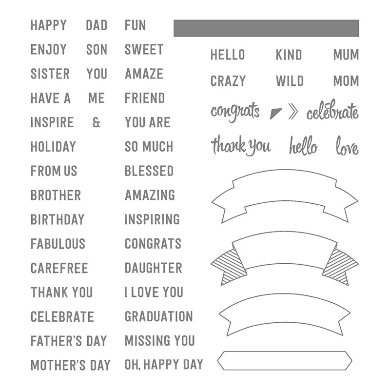
Obviously there is a lot of red and blue, but notice that I added some touches of gold to match King Friday's crown. Also, I wanted to use some sentiments that Mr Rogers would. I looked through all of my stamps to see if I had any that said "I like you" or "You are special". Surprisingly there weren't any! But I made some phrases with some of the words from the Thoughtful Banners set that seemed close enough.

By the way, I copied the design for the card right out of the Annual Catalog. Whenever I feel stuck in coming up with a design, I open my catalog. For this card, I knew that I wanted to use the Thoughtful Banners set, so I turned to that page and saw these cards at the bottom:
I liked the middle card the best, so I simply changed out the colors. This is the very first tip that I shared on this blog!
SIMPLE STAMPING TIP #1 - Copy a design from our catalog. Modify, if needed, to fit your own style or the supplies that you have on hand.
I have read many things about Mr. Rogers and an interesting thing that I learned is that he constantly was sending out notes of encouragement to family, friends, co-workers, and his many "neighbors". That is why it seems entirely appropriate that his picture is on a postage stamp. I hope that you feel inspired to send a card to someone today!


No comments:
Post a Comment